Spatial Autocorrelation
GEO 200CN - Quantitative Geography
Professor Noli Brazil
May 6, 2026
Tobler’s First Law of Geography states that “Everything is related to everything else, but near things are more related than distant things.” The law is capturing the concept of spatial autocorrelation. We will be covering the R functions and tools that measure spatial autocorrelation, closely following OSU Chapters 7 and 8. The objectives of the guide are as follows
- Learn how to create a spatial weights matrix
- Learn how to create a Moran scatterplot
- Calculate global spatial autocorrelation
- Detect clusters using local spatial autocorrelation
To help us accomplish these learning objectives, we will examine air pollution levels in the Sacramento Metropolitan Area. For your assignment this week, answer the questions located in the Assignment 6 document on Canvas.
Installing and loading packages
We’ll be introducing one new package in this lab: spdep. This package contains functions for estimating spatial autocorrelation. Install the package.
install.packages("spdep")The other packages we need should be pretty familiar to you at this
point. Load these packages and our new package using
library()
library(spdep)
library(tidyverse)
library(sf)
library(tmap)Note that spdep isn’t entirely tidy and sf friendly. The package sfdep offers n interface to spdep to integrate with sf objects and tidyverse. We use spdep here because it is still used by most users for running spatial autocorrelation measures and is updated more frequently.
Why measure spatial autocorrelation
Last lab we dealt with the spatial clustering of points. This lab we’re dealing with the spatial clustering of polygons. Or more precisely, the spatial clustering of attributes across polygons. Think about the types of real world geographic objects we can represent with polygons. Neighborhoods are one. People live in neighborhoods. Policy deploys important economic resources at the neighborhood level. We might then be interested in whether certain phenomena, such as poverty or housing displacement are clustered across neighborhoods in a city. Why? Because concentrations of poverty are harder to break up than pockets it of it. Measuring segregation is another good application of clustering. People talk about segregation all the time. But, it is often talked about in very colloquial or imprecise ways. Well, we have actual (geographic) methods to quantify the degree of segregation in a city. If you study soils, perhaps your polygons are plots of land. Are healthy plots clustered? You don’t even need to have administrative boundaries or designated plots of lands to measure spatial autocorrelation. For example, Diniz-Filho, Bini and Hawkins (2003) use equal sized cells to measure the clustering of species diversity in Western Paleartic birds.
Similar to the point pattern analysis guide, we won’t go into the methods that help us explain why something is clustered. We’re just trying to descriptively understand whether our variable of interest is clustered, what is the size or magnitude of the clustering, and where that clustering occurs
Our research questions in this lab are: Do air pollution levels cluster in the Sacramento Metropolitan Area? Where do air pollution levels cluster? Does air pollution concentration differ from the spatial clustering of other environmental hazards?
Bringing in the data
Let’s bring in our main dataset for the lab, a shapefile named sacmetrotracts.shp, which contains a standard measure of air pollution exposure, PM 2.5., for census tracts in the Sacramento Metropolitan Area, taken from the CalEnviroScreen. The data set also contains a variable measuring Children’s Lead Risk from Housing as well as one measuring pesticide use used on agricultural commodities. I zipped up the file and uploaded it onto Github. Set your working directory to an appropriate folder and use the following code to download and unzip the file.
#insert the pathway to the folder you want your data stored into
setwd("insert your pathway here")
#downloads file into your working directory
download.file(url = "https://raw.githubusercontent.com/geo200cn/data/master/sacmetrotracts.zip", destfile = "sacmetrotracts.zip")
#unzips the zipped file
unzip(zipfile = "sacmetrotracts.zip")You should see the sacmetrotracts files in your current
working directory (check getwd() to see where your data
were downloaded). Bring in the shape file using
st_read().
sac.tracts <- st_read("sacmetrotracts.shp")We’ll need to reproject the file into a Coordinate Reference
System that uses meters as the units of distance. Let’s use UTM
Zone 10. We use the sf function
st_transform() to reproject.
sac.tracts <- sac.tracts %>%
st_transform(crs = "+proj=utm +zone=10 +datum=NAD83 +ellps=GRS80") Exploratory mapping
Before we calculate spatial autocorrelation, we should first map our
variable of interest to see if it looks like it clusters across
space. Using the function tm_shape(), here is a choropleth
map using quantile breaks of PM 2.5 levels in the Sacramento metro
area.
tm_shape(sac.tracts, unit = "mi") +
tm_polygons(fill = "PM2_5",
fill.scale = tm_scale(style = "quantile",values = "reds"),
fill.legend = tm_legend(title = "",
position = tm_pos_out("right", "center")))+
tm_scalebar(breaks = c(0, 10, 20), text.size = 1,
position = tm_pos_in("right", "bottom")) +
tm_title("PM 2.5 levels in Sacramento Metropolitan Area Tracts") +
tm_layout(scale = 1, frame = FALSE)
It does look like air pollution levels cluster. In particular, there appears to be a concentration of high PM 2.5. neighborhoods in downtown Sacramento and south Sacramento, and low PM 2.5. areas in the eastern portion of the metro area. What about Lead exposure?
tm_shape(sac.tracts, unit = "mi") +
tm_polygons(fill = "Lead",
fill.scale = tm_scale(style = "quantile",values = "reds"),
fill.legend = tm_legend(title = "",
position = tm_pos_out("right", "center")))+
tm_scalebar(breaks = c(0, 10, 20), text.size = 1,
position = tm_pos_in("right", "bottom")) +
tm_title("Lead Risk in Sacramento Metropolitan Area Tracts") +
tm_layout(scale = 1, frame = FALSE)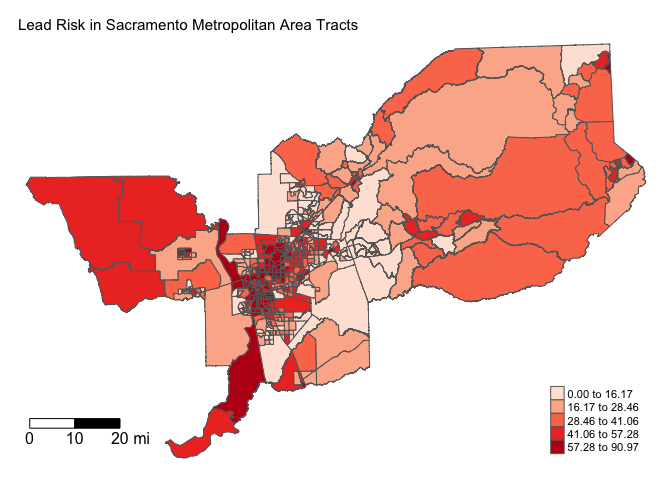
Do you see any noticeable differences in where Lead exposure risk clusters?
Spatial weights matrix
Before we can formally model the dependency shown in the above maps, we must first establish how neighborhoods are spatially connected to one another. That is, what does “near” mean when we say “near things are more related than distant things”? You need to define
- Neighbor connectivity (who is you neighbor?)
- Neighbor weights (how much does your neighbor matter?)
A discussion of the spatial weights matrix is provided at the start of page 200 in OSU.
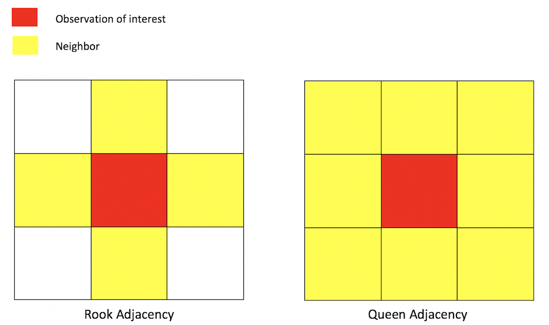
Neighbor connectivity: Contiguity
Sharing a border and/or vertex is a common way of defining a neighbor. The two most common ways of defining contiguity is Rook and Queen adjacency (Figure 1). Rook adjacency refers to neighbors that share a line segment. Queen adjacency refers to neighbors that share a line segment (or border) or a point (or vertex).
Neighbor relationships in R are represented by neighbor nb
objects. An nb object identifies the neighbors for each feature
in the dataset. We use the command poly2nb() from the
spdep package to create a contiguity-based neighbor
object. Let’s specify Queen adjacency.
sacb<-poly2nb(sac.tracts, queen=T)
class(sacb)## [1] "nb"You plug the object sac.tracts into the first argument of
poly2nb() and then specify Queen contiguity using the
argument queen=T. To get Rook adjacency, change the
argument to queen=F.
The function summary() tells us something about how much
the neighborhoods are connected.
summary(sacb)## Neighbour list object:
## Number of regions: 486
## Number of nonzero links: 3068
## Percentage nonzero weights: 1.298921
## Average number of links: 6.312757
## Link number distribution:
##
## 1 2 3 4 5 6 7 8 9 10 11 12 13 15 16 18
## 1 3 25 50 99 97 98 59 28 13 5 2 2 2 1 1
## 1 least connected region:
## 456 with 1 link
## 1 most connected region:
## 269 with 18 linksThe average number of neighbors (adjacent polygons) is 6.3, 1 polygon has 1 neighbor and 1 has 18 neighbors.
Neighbor connectivity: Distance
In distance based connectivity, features within a given radius are considered to be neighbors. The length of the radius is left up to the researcher to decide. For example, Weisburd, Groff and Yang (2012) use a quarter mile (approximately 3-4 city blocks) in their study of crime clusters in Seattle. Often studies test different distances to test the robustness of the findings (e.g. Poulsen et al. 2010). When dealing with polygons, x and y are the coordinates of their centroids (the center of the polygon). You create a radius of distance d2 around the observation of interest - other polygons whose centroids fall inside this radius are tagged as neighbors.
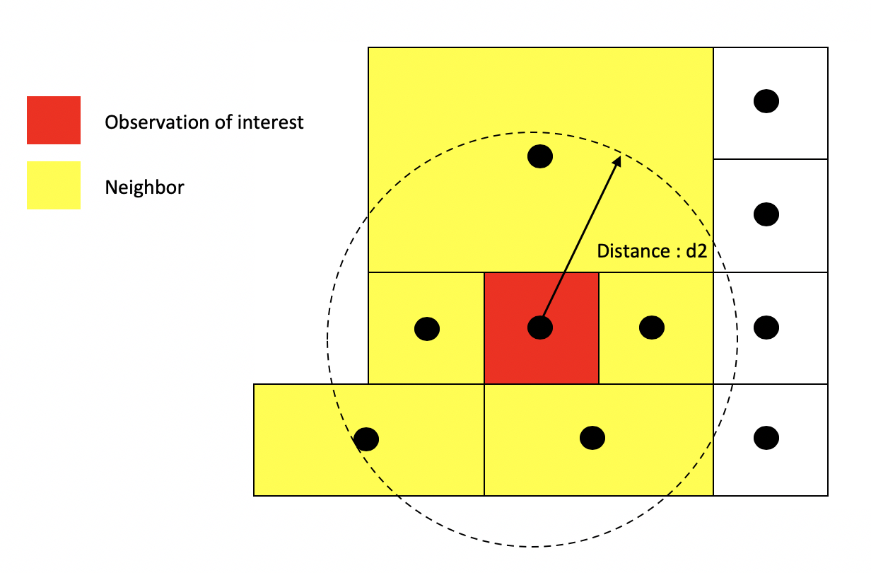
Other distance metrics besides Euclidean are possible depending on the context and area of your subject. For example, Manhattan distance, which uses the road network rather than the straight line measure of Euclidean distance, is often used in city planning and transportation research.
You create a distance based neighbor object using using the function
dnearneigh(), which is a part of the spdep
package. The dnearneigh() function tells R to designate as
neighbors the units falling within the distance specified between
d1 (lower distance bound) and d2 (upper
distance bound). Note that d1 and d2 can be
any distance value as long as they reflect the distance units that our
shapefile is projected in (meters for UTM). The option x
gives the geographic coordinates of each feature in your shapefile which
allows R to calculate distances between each feature to every other
feature in the dataset. We use the coordinates of neighborhood centroids
to calculate distances from one neighborhood to another. First, let’s
extract the centroids using st_centroid().
#extract tract coordinates
sac.coords <- st_centroid(sac.tracts)Using dnearneigh(), we create a distance based nearest
neighbor object where d2 is 20 miles (32186.9 meters).
d1 will equal 0. row.names = specifies the
unique ID for each polygon.
Sacnb_dist1 <- dnearneigh(sac.coords, d1 = 0, d2 = 32186.9,
row.names = sac.tracts$GEOID)Neighbor connectivity: k-nearest neighbors
Another common method for defining neighbors is k-nearest neighbors. This will find the k closest observations for each observation of interest, where k is some integer. For instance, if we define k=3, then each observation will have 3 neighbors, which are the 3 closest observations to it, regardless of the distance between them. Using the k-nearest neighbor rule, two observations could potentially be very far apart and still be considered neighbors.
You create a k-nearest neighbor object using the commands
knearneigh()and knn2nb(). First, create a k
nearest neighbor object using knearneigh() by plugging in
the tract coordinates and specifying k. Then create an
nb object by plugging in the object created by
knearneigh() into knn2nb().
Neighbor weights
We’ve established who our neighbors are by creating an nb
object. The next step is to assign weights to each neighbor
relationship. The weight determines how much each neighbor
counts. You will need to use the nb2listw() command to
create the weights matrix. Let’s create weights for our Queen contiguity
defined neighbor object sacb.
sacw<-nb2listw(sacb, style="W", zero.policy= TRUE)
class(sacw)## [1] "listw" "nb"In the command, you first put in your neighbor nb object
(sacb) and then define the weights style = "W".
Here, style = "W" indicates that the weights for each
spatial unit are standardized to sum to 1 (this is known as row
standardization). For example, the census tract in row 1 has 7
neighbors, and each of those neighbors will have weights of 1/7.
sacw$weights[[1]]## [1] 0.1428571 0.1428571 0.1428571 0.1428571 0.1428571 0.1428571 0.1428571This allows for comparability between areas with different numbers of neighbors.
The argument zero.policy= TRUE deals with situations
when an area has no neighbors based on your definition of neighbor (one
example is Catalina
Island in Southern California). When this happens and you don’t
include zero.policy= TRUE, you’ll get the following
error
Error in nb2listw(countyb, style = "W") : Empty neighbour sets foundWe can visualize the neighbor connections between tracts using the
weight matrix created from nb2listw(). We use the generic
plot() function to create these visuals. Here are the
connections for the Queen contiguity based definition of neighbor.
centroids <- st_centroid(st_geometry(sac.tracts))
plot(st_geometry(sac.tracts), border = "grey60", reset = FALSE)
plot(sacb, coords = centroids, add=T, col = "red")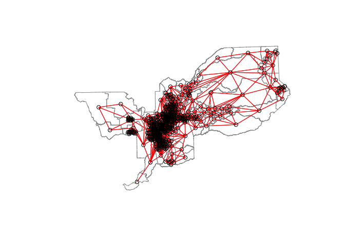
Let’s create the spatial weights matrix for the 20 mile distance
Sacw_dist1<-nb2listw(Sacnb_dist1, style="W", zero.policy= TRUE)The plot of connections for the 20 mile distance based neighbor object and weights matrix yields.
plot(st_geometry(sac.tracts), border = "grey60", reset = FALSE)
plot(Sacw_dist1, coords = centroids, add=T, col = "red")
Notice the difference in the number and density of ties represented in the two maps.
Moran Scatterplot
We’ve now defined what we mean by neighbor by creating an nb
object and the influence of each neighbor by creating a spatial weights
matrix. The first map we created in this guide showed that PM 2.5.
levels appear to be clustered in Sacramento. We can visually explore
this a little more by plotting PM 2.5 on the x-axis and the average PM
2.5 of one’s neighbors (also known as the spatial lag) on the y-axis.
This plot is known as a Moran scatterplot, and it’s described on pages
207-208 in OSU. Let’s create one using the Queen based spatial weights
matrix. Fortunately, spdep has the function
moran.plot() to help us out. Note that the function is not
tidyverse friendly, so we revert to the base
$ convention to call up the variable.
moran.plot(sac.tracts$PM2_5,
listw=sacw,
xlab="PM 2.5",
ylab= "Lagged PM 2.5",
main=c("Moran Scatterplot for PM 2.5"),
zero.policy= TRUE)
Looks like a fairly strong positive association - the higher your neighbors’ average PM 2.5, the higher your PM 2.5. How does it visually compare to Lead exposure?
moran.plot(sac.tracts$Lead,
listw=sacw, xlab="Lead Exposure",
ylab="Lagged Lead Exposure",
main=c("Moran Scatterplot for Lead Expsure"),
zero.policy= TRUE)
What is the slope of the best fit line for a Moran scatterplot?
Global spatial autocorrelation
The map and Moran scatterplot provide descriptive visualizations of clustering (autocorrelation) in PM 2.5. But, rather than eyeballing the correlation, we need a quantitative and objective approach to quantifying the degree to which similar features cluster. This is where global measures of spatial autocorrelation step in. A global index of spatial autocorrelation provides a summary over the entire study area of the level of spatial similarity observed among neighboring observations.
Moran’s I
The most popular test of spatial autocorrelation is the Global
Moran’s I test, which is discussed on page 205 in OSU. Use the command
moran.test() in the spdep package to
calculate the Moran’s I. Within this function, you specify the variable
from the sf object and the spatial weights matrix.
Let’s calculate Moran’s I for PM 2.5 using our Queen contiguity spatial
weights matrix sacw. Note that the function is not
tidyverse friendly.
moran.test(sac.tracts$PM2_5, sacw) ##
## Moran I test under randomisation
##
## data: sac.tracts$PM2_5
## weights: sacw
##
## Moran I statistic standard deviate = 35.549, p-value < 2.2e-16
## alternative hypothesis: greater
## sample estimates:
## Moran I statistic Expectation Variance
## 0.9168038939 -0.0020618557 0.0006680939We find that the Moran’s I is positive (0.92) and statistically significant (p-value < 0.01). Remember from OSU that the Moran’s I is simply a correlation, and correlations go from -1 to 1. A 0.92 correlation is high - OSU uses a rule of thumb of correlations higher than 0.3 and lower than -0.3 as meaningful. Moreover, we find that this correlation is statistically significant (p-value basically at 0).
We can compute a p-value from a Monte Carlo simulation as is
discussed on page 208 in OSU using the moran.mc()
function.
moran.mc(sac.tracts$PM2_5, sacw, nsim=999, zero.policy= TRUE)##
## Monte-Carlo simulation of Moran I
##
## data: sac.tracts$PM2_5
## weights: sacw
## number of simulations + 1: 1000
##
## statistic = 0.9168, observed rank = 1000, p-value = 0.001
## alternative hypothesis: greaterThe only difference between moran.test() and
moran.mc() is that we need to set nsim= in the
latter, which specifies the number of random simulations to run. We end
up with a p-value of 0.001. You can use the distance and k-nearest
neighbor based definitions to test how sensitive the results are to
different definitions of neighbor.
Is the clustering of air pollution levels greater than the clustering of Lead exposure?
moran.mc(sac.tracts$Lead, sacw, nsim=999, zero.policy= TRUE)##
## Monte-Carlo simulation of Moran I
##
## data: sac.tracts$Lead
## weights: sacw
## number of simulations + 1: 1000
##
## statistic = 0.63445, observed rank = 1000, p-value = 0.001
## alternative hypothesis: greaterWhat about pesticide use?
moran.mc(sac.tracts$Pesticide, sacw, nsim=999, zero.policy= TRUE)##
## Monte-Carlo simulation of Moran I
##
## data: sac.tracts$Pesticide
## weights: sacw
## number of simulations + 1: 1000
##
## statistic = 0.2416, observed rank = 1000, p-value = 0.001
## alternative hypothesis: greaterGeary’s c
Another popular index of global spatial autocorrelation is Geary’s c
which is a cousin to the Moran’s I. Similar to Moran’s I, it is best to
test the statistical significance of Geary’s c using a Monte Carlo
simulation. You use geary.mc() to calculate Geary’s c. OSU
discusses Geary’s c on page 211.
geary.mc(sac.tracts$PM2_5, sacw, nsim = 999)##
## Monte-Carlo simulation of Geary C
##
## data: sac.tracts$PM2_5
## weights: sacw
## number of simulations + 1: 1000
##
## statistic = 0.087029, observed rank = 1, p-value = 0.001
## alternative hypothesis: greaterCompared to Lead and Pesticide use
geary.mc(sac.tracts$Lead, sacw, nsim = 999)##
## Monte-Carlo simulation of Geary C
##
## data: sac.tracts$Lead
## weights: sacw
## number of simulations + 1: 1000
##
## statistic = 0.36163, observed rank = 1, p-value = 0.001
## alternative hypothesis: greatergeary.mc(sac.tracts$Pesticide, sacw, nsim = 999)##
## Monte-Carlo simulation of Geary C
##
## data: sac.tracts$Pesticide
## weights: sacw
## number of simulations + 1: 1000
##
## statistic = 0.98097, observed rank = 449, p-value = 0.449
## alternative hypothesis: greaterLocal spatial autocorrelation
The Moran’s I tells us whether clustering exists in the area. It does not tell us, however, where clusters are located. These issues led Geographers to consider local forms of the global indices, known as Local Indicators of Spatial Association (LISAs).
LISAs have the primary goal of providing a local measure of similarity between each unit’s value (in our case, PM 2.5) and those of nearby cases. That is, rather than one single summary measure of spatial association (Moran’s I), we have a measure for every single unit in the study area. We can then map each tract’s LISA value to provide insight into the location of neighborhoods with comparatively high or low associations with neighboring values (i.e. hot or cold spots).
Getis-Ord
A popular local measure of spatial autocorrelation is Getis-Ord, which is discussed on page 219 in OSU. There are two versions of the Getis-Ord, Gi and Gi*. Gi uses only neighbors to calculate hot and cold spots whereas Gi* includes the location itself in the calculation.
Let’s calculate Gi*.
To do this, we need to use the include.self() function. We
use this function on sacb to create an nb object that
includes the location itself as one of the neighbors.
sacb.self <- include.self(sacb)
class(sacb.self)## [1] "nb"We then plug this new self-included nb object into
nb2listw() to create a self-included spatial weights
object
sac.w.self <- nb2listw(sacb.self, style="W", zero.policy= TRUE)We calculate Gi*
for each tract using the function localG() which is part of
the spdep package. You plug in the variable you want to
find clusters for and the self-included spatial weights object
sac.w.self(). Let’s do this for PM 2.5 levels. Note that
the function is not tidyverse friendly.
localgstar<-localG(sac.tracts$PM2_5, sac.w.self, zero.policy = TRUE)The command returns a localG object containing the Z-scores for the Gi* statistic.
summary(localgstar)## Min. 1st Qu. Median Mean 3rd Qu. Max.
## -13.67204 -0.67037 0.85987 0.05405 1.45411 3.89400Local Getis-Ord has returned z-scores between -13.67204 and 3.89400. This statistic can describe where hot and cold spots cluster. The interpretation of the Z-score is straightforward: a large positive value suggests a cluster of high PM 2.5 (hot spot) and a large negative value indicates a cluster of low PM 2.5 (cold spot).
In order to plot the results, you’ll need to coerce the object localgstar to be numeric.
class(localgstar)## [1] "localG"Let’s do this using as.numeric() and save the numeric
vector into our sf object sac.tracts.
sac.tracts <- sac.tracts %>%
mutate(localgstar = as.numeric(localgstar))We can create a map of the Gi* values like OSU does in Figure 8.1 on page 221 (their map is for the regular Gi). We’ll break up the values by quintile.
tm_shape(sac.tracts, unit = "mi") +
tm_polygons(fill = "localgstar",
fill.scale = tm_scale(style = "quantile", values = "-RdBu"),
fill.legend = tm_legend( title = "Gi* value",
position = tm_pos_out("right", "center"))) +
tm_scale_bar(breaks = c(0, 10, 20), text.size = 1,
position = tm_pos_in("right", "bottom")) +
tm_title("Sacramento PM 2.5.") +
tm_layout(scale = 1, frame = FALSE)
You show more spread of Gi* by showing deciles.
tm_shape(sac.tracts, unit = "mi") +
tm_polygons(fill = "localgstar",
fill.scale = tm_scale(style = "quantile", values = "-RdBu",
n = 10),
fill.legend = tm_legend( title = "Gi* value",
position = tm_pos_out("right", "center"))) +
tm_scale_bar(breaks = c(0, 10, 20), text.size = 1,
position = tm_pos_in("right", "bottom")) +
tm_title("Sacramento PM 2.5.") +
tm_layout(scale = 1, frame = FALSE)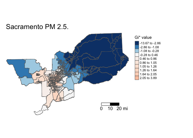
The argument palette = "-RdBu" reverses the colors such
that higher values are red (hot) and lower values are blue (cold).
The values you get from localG() are Z scores. We might
interpret Z scores outside -1.96 and 1.96 as unusual cases, or
statistically significant hot spots at the 95% level (remember that
-1.96 and 1.96 represent the values on the standard normal distribution
that correspond to a 95% confidence interval). However, OSU on page 221
warns that normality in the distribution of local statistics is often
not met. Nevertheless, let’s see where hot and cold spots are located
using Z values that are associated with 99, 95 and 90 percent confidence
intervals.
Below we use the function case_when() to categorize hot
and cold spots based on different significance levels (1% (or 99%), 5%
(or 95%), and 10% (or 90%)) using the appropriate Z-scores. We then set
the categorical variable as a factor, ordering the levels from cold to
not significant to hot.
sac.tracts <- sac.tracts %>%
mutate(hotspotsg = case_when(
localgstar <= -2.58 ~ "Cold spot 99%",
localgstar > -2.58 & localgstar <=-1.96 ~ "Cold spot 95%",
localgstar > -1.96 & localgstar <= -1.65 ~ "Cold spot 90%",
localgstar >= 1.65 & localgstar < 1.96 ~ "Hot spot 90%",
localgstar >= 1.96 & localgstar <= 2.58 ~ "Hot spot 95%",
localgstar >= 2.58 ~ "Hot spot 99%",
TRUE ~ "Not Significant"))
#coerce into a factor, and sort levels from cold to not significant to hot
sac.tracts <- sac.tracts %>%
mutate(hotspotsg = factor(hotspotsg,
levels = c("Cold spot 99%", "Cold spot 95%",
"Cold spot 90%", "Not Significant",
"Hot spot 90%", "Hot spot 95%",
"Hot spot 99%")))Then map the clusters using tm_shape() using a blue,
white and red color palette.
tm_shape(sac.tracts, unit = "mi") +
tm_polygons(fill = "hotspotsg",
fill.scale = tm_scale_ordinal(values = c("blue","white", "red")),
fill.legend = tm_legend(title = "",
position = tm_pos_out("right", "center")))+
tm_scalebar(breaks = c(0, 10, 20), text.size = 1,
position = tm_pos_in("right", "bottom")) +
tm_title("Sacramento PM 2.5 Clusters") +
tm_layout(scale = 1, frame = FALSE)
We can also eliminate the different significance levels and simply designate hot and cold spots as tracts with Z-scores above 1.96 and below -1.96 (95% significance level).
sac.tracts <- sac.tracts %>%
mutate(hotspotsgs95 = case_when(
localgstar <=-1.96 ~ "Cold spot",
localgstar >= 1.96 ~ "Hot spot",
TRUE ~ "Not Significant"),
hotspotsgs95 = factor(hotspotsgs95,
levels = c("Cold spot",
"Not Significant",
"Hot spot")))And then map. We save the map in an object named sac.pm25.map.g.
sac.pm25.map.g <- tm_shape(sac.tracts, unit = "mi") +
tm_polygons(fill = "hotspotsgs95",
fill.scale = tm_scale_ordinal(values = c("blue","white", "red")),
fill.legend = tm_legend(title = "",
position = tm_pos_out("right", "center")))+
tm_scalebar(breaks = c(0, 10, 20), text.size = 1,
position = tm_pos_in("right", "bottom")) +
tm_title("Sacramento PM 2.5 Clusters") +
tm_layout(scale = 1, frame = FALSE)
sac.pm25.map.g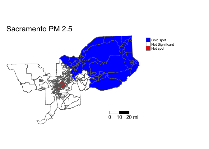
Let’s put it into an interactive map. To do so, use the function
tmap_mode()
tmap_mode("view")To change the mapping view to one that is not interactive, use “plot”
in tmap_mode().
Where do high and low PM 2.5 neighborhoods cluster? Zoom in and find out.
sac.pm25.map.g + tm_view()Run Getis-Ord for Lead exposure and determine whether its local clusters overlap with PM 2.5 hot and cold spots.
Local Moran’s I
Another popular measure of local spatial autocorrelation is the local
Moran’s I, which is discussed on page 222 in OSU. We can calculate the
local Moran’s I using the command localmoran_perm() found
in the spdep package. First, a random number seed is
set given that we are using the conditional permutation approach to
calculating statistical significance. This will ensure reproducibility
of results when the process is re-run.
#set random seed for reproducibility
set.seed(1918)
locali<-localmoran_perm(sac.tracts$PM2_5, sacw, nsim = 999) %>%
as_tibble() %>%
set_names(c("local_i", "exp_i", "var_i", "z_i", "p_i",
"p_i_sim", "pi_sim_folded", "skewness", "kurtosis"))The resulting object is a matrix with the local statistic, the
expectation of the local statistic, the variance, the Z score (deviation
of the local statistic from the expectation divided by the standard
deviation), and the p-value. We transformed the matrix into a tibble
using as_tibble(), and added appropriate variable names to
each column using set_names().
Save the local statistic and the Z-score into our sf object sac.tracts for mapping purposes.
sac.tracts <- sac.tracts %>%
bind_cols(locali)We have to make our own identifiers for statistically significant clusters. Let’s designate any areas with Z-scores greater than 1.96 or less than -1.96 as high and low clusters, respectively.
sac.tracts <- sac.tracts %>%
mutate(mcluster = case_when(
z_i <=-1.96 ~ "Negative Correlation",
z_i >= 1.96 ~ "Positive Correlation",
TRUE ~ "Not Significant"),
mcluster = factor(mcluster,
levels = c("Negative Correlation",
"Not Significant",
"Positive Correlation")))Now we map!
#set back to plotting
tmap_mode("plot")
tm_shape(sac.tracts, unit = "mi") +
tm_polygons(fill = "mcluster",
fill.scale = tm_scale_ordinal(values = c("blue","white", "red")),
fill.legend = tm_legend(title = "",
position = tm_pos_out("right", "center")))+
tm_scalebar(breaks = c(0, 10, 20), text.size = 1,
position = tm_pos_in("right", "bottom")) +
tm_title("Sacramento PM 2.5 Clusters") +
tm_layout(scale = 1, frame = FALSE)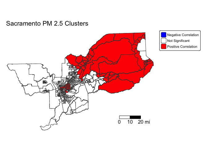
Positive values indicate similarity between neighbors while negative values indicate dissimilarity. This means that high values of Ii indicate that similar values are being clustered. In contrast, low values of Ii indicate that dissimilar (high and low) values are clustered. When working with the local Moran’s I, you will want to link it back to the four quadrants of the Moran scatterplot where we identified High-High, Low-Low, High-Low, and Low-High clusters (described on page 222 in OSU). This will allow you to create the type of map produced on page 11 in Scott et al. (2010).
Answer the assignment 6 questions that are uploaded on Canvas. Submit an R Markdown and its knitted document on Canvas by the assignment due date.

This
work is licensed under a
Creative
Commons Attribution-NonCommercial 4.0 International License.
Website created and maintained by Noli Brazil