More Linear Regression
GEO 200CN - Quantitative Geography
Professor Noli Brazil
April 20, 2026
We’re in the second leg of our journey into linear regression. In last lab, we learned about simple and multiple linear regression and model fit. In this lab, we go through the R functions for running regression diagnostics. We also cover other aspects of linear regression modelling. The objectives of this lab are as follows
- Learn how to run diagnostic tools to evaluate Ordinary Least Squares (OLS) regression assumptions
- Learn how to include interactions terms
- Learn how to detect and deal with multicollinearity
To help us accomplish these learning objectives, we will continue examining the association between neighborhood characteristics and housing eviction rates in the Sacramento metropolitan area. We’ll be closely following the material presented in Handout 4.
Installing and loading packages
We need to install one new package.
install.packages("factoextra")Load this package and other packages we need.
library(MASS)
library(tidyverse)
library(factoextra)
Bringing in the data
We’ll be using the same Sacramento eviction data from last lab.
Download the csv file sac_metro_eviction.csv located on Canvas
in the Week 4 Lab and Assignments folder. Read in the csv file using the
read_csv() function.
sac_metro <- read_csv("sac_metro_eviction.csv")2017 eviction rate case data were downloaded from the Eviction Lab website. Socioeconomic and demographic data were downloaded from the 2013-2017 American Community Survey. A record layout of the data can be found here. Our research question in this lab is: What ecological characteristics are associated with neighborhood eviction rates in the Sacramento metropolitan area?
Checking OLS assumptions
The linear regression handout outlines the core assumptions that need to be met in order to obtain unbiased regression estimates from an OLS model. The handout also goes through several diagnostic tools for examining whether an OLS model breaks these assumptions. In this section, we will go through how to run most of these diagnostics in R.
Let’s also create a fake dataset that meets the OLS assumptions to act as a point of comparison along the way. We’ll call this the goodreg model.
#sets a seed so the following is reproducible
set.seed(08544)
x <-rnorm(5000, mean = 7, sd = 1.56)# just some normally distributed data

## We're establishing here a linear relationship,
## What's this "true" linear relationship we're setting up?
## So that y = 12 - .4x + some normally distributed error values
y <- 12 - 0.4*x +rnorm(5000, mean = 0, sd = 1)

goodreg <- lm(y ~ x)
summary(goodreg)
##
## Call:
## lm(formula = y ~ x)
##
## Residuals:
## Min 1Q Median 3Q Max
## -3.7188 -0.6658 0.0158 0.6944 3.5102
##
## Coefficients:
## Estimate Std. Error t value Pr(>|t|)
## (Intercept) 12.033221 0.064450 186.71 <2e-16 ***
## x -0.402152 0.008986 -44.75 <2e-16 ***
## ---
## Signif. codes: 0 '***' 0.001 '**' 0.01 '*' 0.05 '.' 0.1 ' ' 1
##
## Residual standard error: 0.9932 on 4998 degrees of freedom
## Multiple R-squared: 0.2861, Adjusted R-squared: 0.2859
## F-statistic: 2003 on 1 and 4998 DF, p-value: < 2.2e-16To be clear, we know the exact functional form of this model, all OLS assumptions should be met, and therefore this model should pass all diagnostics.
In the last lab guide, we ran a simple regression model using
ordinary least squares (OLS) to estimate the relationship between
eviction rates per 100 renting households and percent unemployed at the
neighborhood level. Let’s run this model using lm() and
save its results in an object named lm1. Our dependent variable
is evict and the independent variable is punemp.
#eliminate scientific notation
options(scipen=999)

lm1 <- lm(evict ~ punemp,
          data = sac_metro)

#results
summary(lm1)
##
## Call:
## lm(formula = evict ~ punemp, data = sac_metro)
##
## Residuals:
## Min 1Q Median 3Q Max
## -2.1572 -0.8287 -0.3145 0.5179 6.4098
##
## Coefficients:
## Estimate Std. Error t value Pr(>|t|)
## (Intercept) 0.95715 0.12183 7.856 0.0000000000000375 ***
## punemp 0.09143 0.01462 6.254 0.0000000010381178 ***
## ---
## Signif. codes: 0 '***' 0.001 '**' 0.01 '*' 0.05 '.' 0.1 ' ' 1
##
## Residual standard error: 1.2 on 397 degrees of freedom
## Multiple R-squared: 0.08967, Adjusted R-squared: 0.08738
## F-statistic: 39.11 on 1 and 397 DF, p-value: 0.000000001038Normally distributed errors
We can rely on several tools for testing the errors are normally
distributed assumption. The first is a histogram of residuals. We can
extract the residuals from an lm object using the function
resid(). We will need to use the residuals for other
diagnostics, so let’s save them into the sac_metro data frame
under the variable resid using the mutate()
function.
sac_metro <- sac_metro %>%
            mutate(resid = resid(lm1))
The order of the tracts inresid(lm1) is the same as the
order of the tracts in sac_metro and that’s why we were able to
directly column bind it like we did in the above code.
Now, we create a histogram of residuals using our best bud
ggplot() which we met in Week
2.
sac_metro %>%
  ggplot() +
  geom_histogram(mapping = (aes(x=resid))) +
  xlab("Absolute Residuals")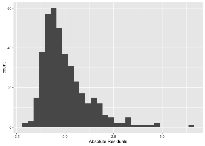
We’re trying to see if its shape is that of a normal distribution
(bell curve). This is a histogram of absolute residuals. To get a
histogram of standardized residuals use the function
stdres(), where the main argument is our model results
lm1
sac_metro %>%
  ggplot() +
  geom_histogram((aes(x=stdres(lm1)))) +
  xlab("Standardized Residuals")
You can also plot a histogram of the studentized residuals using the
function rstudent()
sac_metro %>% ggplot() +
  geom_histogram((aes(x=rstudent(lm1)))) +
  xlab("Studentized Residuals")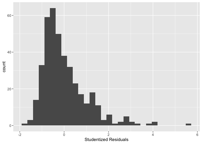
For comparison, the following is what the residuals from our simulated good data look like
ggplot() + geom_histogram(aes(x = stdres(goodreg))) +
  xlab("Standardized Residuals") +
  ggtitle("Distribution of Residuals - Simulated Data")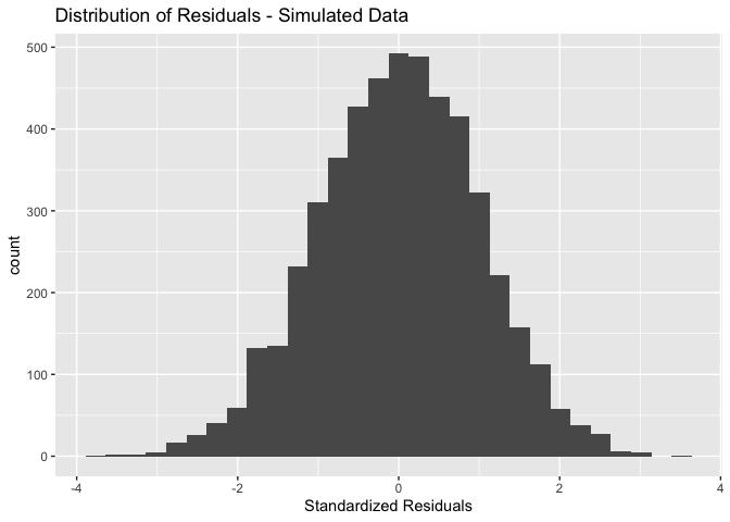
You can also examine a normal probability plot, also known as a Q-Q
plot, to check error normality. Use the function qqnorm()
and just plug in the model residuals. The function qqline()
adds the line for what normally distributed data should theoretically
follow.
qqnorm(sac_metro$resid)
qqline(sac_metro$resid,col="red")
In short, if the points of the plot do not closely follow a straight line, this would suggest that the data do not come from a normal distribution. What does the Q-Q plot look like for our good model?
qqnorm(stdres(goodreg))
qqline(stdres(goodreg),col="red")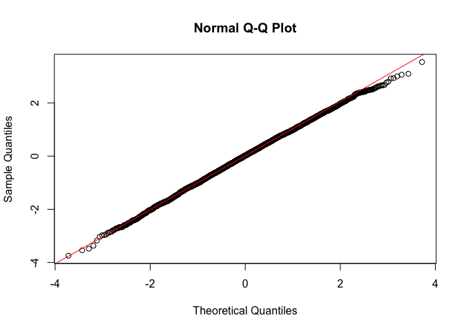
Question 1: What do you conclude by visually examining the histogram and Q-Q plot of the lm1 residuals?
Histograms and Q-Q plots give a nice visual presentation of the
residual distribution, however if we are interested in formal hypothesis
testing, there are a number of options available. A commonly used test
is the Shapiro–Wilk test, which is implemented in R using the function
shapiro.test(). The null is that the data are normally
distributed. Our good model goodreg should not reject the
null
shapiro.test(resid(goodreg))##
## Shapiro-Wilk normality test
##
## data: resid(goodreg)
## W = 0.9994, p-value = 0.1026What about our simple linear regression model?
shapiro.test(resid(lm1))##
## Shapiro-Wilk normality test
##
## data: resid(lm1)
## W = 0.88656, p-value < 0.00000000000000022What’s the conclusion?
Residual scatterplots
You can use a plot of the residuals against the fitted values for checking both the linearity and homoscedasticity assumptions. We should look for three things in this plot.
- At any fitted value, the mean of the residuals should be roughly 0. If this is the case, the linearity assumption is valid. For this reason, we generally add a horizontal line in the plot at y = 0 to emphasize this point.
- At every fitted value, the spread of the residuals should be roughly the same. If this is the case, the homoscedasticity (equal variance) assumption is valid.
- There should be no pattern in the residuals.
We know what diagnostic plots should look like when we have good data. But what about for bad data? Below is an example of some bad data that breaks the linearity assumption. Don’t worry too much about the intricacies of the code below - we’re creating simulated data that is deliberately not normal so you can see what nonlinearity looks like in the context of the diagnostic tools we’ve been running.
#set a random seed so reproducible
set.seed(42)
sim_3 = function(sample_size = 500) {
  x = runif(n = sample_size) * 5
  y = 3 + 5 * x ^ 2 + rnorm(n = sample_size, mean = 0, sd = 5)
  data.frame(x, y)
}

sim_data_3 = sim_3()
badreg = lm(y ~ x,
            data = sim_data_3)
Here is the residual vs fitted values plot for badreg. What do you see that let’s you know this model breaks OLS assumptions?
plot(fitted(badreg), resid(badreg), col = "grey", pch = 20,
     xlab = "Fitted", ylab = "Residuals", main = "Data from Bad Model")
abline(h = 0, col = "darkorange", lwd = 2)
Question 2: Create a residual against fitted value plot as described by Handout 4 for the lm1 model. Do the same for the goodreg model. What do you conclude from these plots?
Controlling for variables
The most common reason why your model is breaking OLS assumptions is because you’ve failed to include a variable that is confounding the relationship between your primary independent variable(s) and the outcome. Here, we are interested in examining the impact of a variable X on the outcome Y controlling for the impact of another variable Z. In other words, we don’t really care about the effect of Z, but simply want to control for it so we can get an unbiased estimate of the effect of X. In this case, Z is a confounding variable. Let’s try to make clear what we mean by confounding. Here are three ways to define a confounding variable, all saying the same thing, but in different ways.
Confounding variables or confounders are often defined as variables that correlate (positively or negatively) with both the dependent variable and the independent variable
A confounder is an extraneous variable whose presence affects the variables being studied so that the results do not reflect the actual relationship between the variables under study.
A third variable, not the dependent (outcome) or main independent (exposure) variable of interest, that distorts the observed relationship between the exposure and outcome.
Confounding can have serious consequences for your results. Going back to our case study of Sacramento let’s say we ran a simple linear regression of eviction rates on the median age of housing units in the neighborhood.
summary(lm(evict ~  medage,
           data = sac_metro))
##
## Call:
## lm(formula = evict ~ medage, data = sac_metro)
##
## Residuals:
## Min 1Q Median 3Q Max
## -1.8200 -0.8991 -0.2816 0.5505 6.3894
##
## Coefficients:
## Estimate Std. Error t value Pr(>|t|)
## (Intercept) 1.16320 0.18663 6.233 0.00000000117 ***
## medage 0.01104 0.00425 2.597 0.00975 **
## ---
## Signif. codes: 0 '***' 0.001 '**' 0.01 '*' 0.05 '.' 0.1 ' ' 1
##
## Residual standard error: 1.247 on 397 degrees of freedom
## Multiple R-squared: 0.01671, Adjusted R-squared: 0.01423
## F-statistic: 6.745 on 1 and 397 DF, p-value: 0.009753We would conclude that a one year increase in the median age of housing units is associated with an increase of 0.01104 eviction cases per 100 renting households. The results also show that the coefficient has a p-value of 0.00975, which indicates that the medage coefficient is statistically significant at the 0.01 level. This means that the probability that the association between medage and evict is due to chance is 100*0.00975 = 0.975 percent. In other words, the probability of seeing the association 0.01104 just by chance if the null hypothesis is true is a little less than one percent.
But, when you include median gross rent, you get
summary(lm(evict ~ medage + rent,
           data = sac_metro))
##
## Call:
## lm(formula = evict ~ medage + rent, data = sac_metro)
##
## Residuals:
## Min 1Q Median 3Q Max
## -1.8670 -0.8370 -0.2701 0.5416 6.3404
##
## Coefficients:
## Estimate Std. Error t value Pr(>|t|)
## (Intercept) 2.6975817 0.4226376 6.383 0.000000000487 ***
## medage 0.0008342 0.0048798 0.171 0.864
## rent -0.0009009 0.0002236 -4.028 0.000067339161 ***
## ---
## Signif. codes: 0 '***' 0.001 '**' 0.01 '*' 0.05 '.' 0.1 ' ' 1
##
## Residual standard error: 1.224 on 396 degrees of freedom
## Multiple R-squared: 0.05541, Adjusted R-squared: 0.05064
## F-statistic: 11.62 on 2 and 396 DF, p-value: 0.00001253Question 3: In your own words, explain why the statistically significant relationship between median age of housing units and eviction rates disappeared when we included median rent.
This example illustrates the importance of accounting for potential confounding in your model. This includes confounding introduced by spatial dependency or autocorrelation, which we will discuss later in the quarter.
Interactions
The multiple linear regressions models we’ve run so far assume that the effects of each of the independent variables are additive. However, as discussed in this week’s handout, that may be incorrect. Instead, the impact of a variable on the outcome may depend on the level of another variable (and vice versa). To test this, we include an interaction term in the model.
It is easy to include interaction terms in a linear model using the
lm() function. Let’s interact the variables medage
and punemp. The syntax medage*punemp
simultaneously includes medage, punemp, and the
interaction term medage x punemp as predictors.
summary(lm(evict ~ medage*punemp,
           data = sac_metro))
##
## Call:
## lm(formula = evict ~ medage * punemp, data = sac_metro)
##
## Residuals:
## Min 1Q Median 3Q Max
## -2.3396 -0.8315 -0.2920 0.5086 6.4454
##
## Coefficients:
## Estimate Std. Error t value Pr(>|t|)
## (Intercept) 1.137917 0.376065 3.026 0.00264 **
## medage -0.002722 0.008179 -0.333 0.73943
## punemp 0.029268 0.057101 0.513 0.60854
## medage:punemp 0.001211 0.001153 1.050 0.29437
## ---
## Signif. codes: 0 '***' 0.001 '**' 0.01 '*' 0.05 '.' 0.1 ' ' 1
##
## Residual standard error: 1.2 on 395 degrees of freedom
## Multiple R-squared: 0.09493, Adjusted R-squared: 0.08805
## F-statistic: 13.81 on 3 and 395 DF, p-value: 0.00000001396The coefficient estimate for the interaction term is in the row
designated by medage:punemp. In this case, the coefficient
is not statistically significant at conventional levels.
How about including an interaction between the categorical variable county and punemp?
lm.int <- lm(evict ~ county*punemp,
           data = sac_metro)

summary(lm.int)
##
## Call:
## lm(formula = evict ~ county * punemp, data = sac_metro)
##
## Residuals:
## Min 1Q Median 3Q Max
## -2.2645 -0.7400 -0.1558 0.4142 6.2578
##
## Coefficients:
## Estimate Std. Error t value Pr(>|t|)
## (Intercept) 2.91924 0.43999 6.635 0.000000000109 ***
## countyPlacer -2.56317 0.58467 -4.384 0.000014998655 ***
## countySacramento -1.79286 0.45984 -3.899 0.000114 ***
## countyYolo -2.49384 0.59635 -4.182 0.000035722490 ***
## punemp -0.12269 0.05552 -2.210 0.027683 *
## countyPlacer:punemp 0.12507 0.08821 1.418 0.156995
## countySacramento:punemp 0.21141 0.05755 3.673 0.000273 ***
## countyYolo:punemp 0.20743 0.07971 2.602 0.009610 **
## ---
## Signif. codes: 0 '***' 0.001 '**' 0.01 '*' 0.05 '.' 0.1 ' ' 1
##
## Residual standard error: 1.116 on 391 degrees of freedom
## Multiple R-squared: 0.2252, Adjusted R-squared: 0.2114
## F-statistic: 16.24 on 7 and 391 DF, p-value: < 0.00000000000000022Question 4: What is the estimated slope coefficient of punemp for Sacramento county? Put another way, what is the association between punemp and the eviction rate for neighborhoods in Sacramento county?
Multicollinearity
It might seem that if confounding is such a big problem (and it is when trying to make causal inferences) you should aim to try to control for everything. Including the kitchen sink. The downside of this strategy is that including too many variables will likely introduce multicollinearity in your model. Multicollinearity is defined to be high, but not perfect, correlation between two independent variables in a regression.
What are the effects of multicollinearity? Mainly you will get blown up standard errors for the coefficient on one of your correlated variables. In other words, you will not detect a relationship even if one does exist because the standard error on the coefficient is artificially inflated.
What to do? First, run a correlation matrix for all your proposed
independent variables. Let’s say we wanted to run an OLS model including
pblk, phisp, pund18, totp,
punemp, rent, vacancy, medage,
pburden, medincome, median_rooms,
pct_foreign_born and percent_ooh as independent
variables. One way of obtaining a correlation matrix is to use the
cor() function. We use the function select()
to keep the variables we need from sac_metro. We use the
round() function to round up the correlation values to two
significant digits after the decimal point.
round(cor(dplyr::select(sac_metro, pblk, phisp, pund18, punemp, totp, rent, vacancy, medage,
                        pburden, medincome, median_rooms, pct_foreign_born,percent_ooh )),2)
## pblk phisp pund18 punemp totp rent vacancy medage pburden
## pblk 1.00 0.29 0.30 0.39 0.06 -0.26 -0.09 0.01 0.25
## phisp 0.29 1.00 0.36 0.34 0.07 -0.38 -0.01 0.26 0.24
## pund18 0.30 0.36 1.00 0.13 0.36 0.15 -0.24 -0.25 0.13
## punemp 0.39 0.34 0.13 1.00 -0.03 -0.45 0.12 0.26 0.32
## totp 0.06 0.07 0.36 -0.03 1.00 0.21 -0.25 -0.35 0.00
## rent -0.26 -0.38 0.15 -0.45 0.21 1.00 -0.17 -0.52 -0.25
## vacancy -0.09 -0.01 -0.24 0.12 -0.25 -0.17 1.00 0.17 0.04
## medage 0.01 0.26 -0.25 0.26 -0.35 -0.52 0.17 1.00 0.08
## pburden 0.25 0.24 0.13 0.32 0.00 -0.25 0.04 0.08 1.00
## medincome -0.43 -0.50 0.05 -0.55 0.20 0.70 -0.20 -0.42 -0.45
## median_rooms -0.31 -0.35 0.29 -0.41 0.30 0.68 -0.25 -0.40 -0.27
## pct_foreign_born -0.09 -0.44 -0.03 -0.30 0.09 0.38 -0.25 -0.25 -0.24
## percent_ooh -0.45 -0.36 0.15 -0.41 0.21 0.62 -0.10 -0.30 -0.31
## medincome median_rooms pct_foreign_born percent_ooh
## pblk -0.43 -0.31 -0.09 -0.45
## phisp -0.50 -0.35 -0.44 -0.36
## pund18 0.05 0.29 -0.03 0.15
## punemp -0.55 -0.41 -0.30 -0.41
## totp 0.20 0.30 0.09 0.21
## rent 0.70 0.68 0.38 0.62
## vacancy -0.20 -0.25 -0.25 -0.10
## medage -0.42 -0.40 -0.25 -0.30
## pburden -0.45 -0.27 -0.24 -0.31
## medincome 1.00 0.82 0.51 0.73
## median_rooms 0.82 1.00 0.51 0.88
## pct_foreign_born 0.51 0.51 1.00 0.44
## percent_ooh 0.73 0.88 0.44 1.00Any correlation that is high is worth flagging. In this case, we see a few pairwise correlations that are close to and above 0.5 that should be worth keeping in mind.
You can also run your regression and then detect multicollinearity in your results. Signs of multicollinearity include
- Large changes in the estimated regression coefficients when a predictor variable is added or deleted
- Lack of statistical significance despite high R2
- Estimated regression coefficients have an opposite sign from predicted
A formal and likely the most common indicator of multicollinearity is
the Variance Inflation Factor (VIF). Use the function vif()
in the car package to get the VIFs for each variable.
Let’s check the VIFs for the proposed model. First, run the model and
save it into lm2.
lm2 <- lm(evict ~  pblk + phisp + pund18 + punemp + totp + rent+ vacancy +
            medage + pburden + medincome + median_rooms + pct_foreign_born + percent_ooh,
          data = sac_metro)
Then get the VIF values using vif(). As described in the
handout, another measure of multicollinearity - tolerance - can be
obtained from the VIF values.
Question 5: Assess the presence of multicollinearity using the VIF.
Principal components analysis
One approach to resolving problems with multicollinearity is dimension reduction, which transforms the predictors into a series of dimensions that represent the variance in the predictors but are uncorrelated with one another. One of the most popular methods for dimension reduction is Principal Components Analysis (PCA). PCA reduces a higher-dimensional dataset into a lower-dimensional representation based on linear combinations of the variables used. The first principal component is the linear combination of variables that explains the most overall variance in the data; the second principal component explains the second-most overall variance but is also constrained to be uncorrelated with the first component; and so on.
PCA can be computed with the prcomp() function, which is
a part of the package stats, a pre-installed
package.
pca<-prcomp(~pblk + phisp + pund18 + punemp + totp + rent+ vacancy +
             medage + pburden + medincome + median_rooms + pct_foreign_born + percent_ooh,
                  center=T, scale=T, data=sac_metro, na.action = na.exclude)
The first argument specifies the variables we want to include in the
index, starting first with a tilde sign ~ then followed by
each variable separated by a +. The arguments center=T and
scale=T effectively standardize our variables. Always use z-scored
variables when doing a PCA - scale is very important, as we want
correlations going in, not covariances. And then data=
specifies the dataset. The argument na.action = na.exclude
tells the function to exclude the observations with NA values, but
retain them as NA when computing the scores (we did not need this
here).
summary(pca)## Importance of components:
## PC1 PC2 PC3 PC4 PC5 PC6 PC7
## Standard deviation 2.2125 1.4412 1.01658 0.96058 0.89527 0.87183 0.82483
## Proportion of Variance 0.3765 0.1598 0.07949 0.07098 0.06165 0.05847 0.05233
## Cumulative Proportion 0.3765 0.5363 0.61581 0.68679 0.74844 0.80691 0.85924
## PC8 PC9 PC10 PC11 PC12 PC13
## Standard deviation 0.7147 0.64232 0.59521 0.52833 0.45098 0.26384
## Proportion of Variance 0.0393 0.03174 0.02725 0.02147 0.01565 0.00535
## Cumulative Proportion 0.8985 0.93028 0.95753 0.97900 0.99465 1.00000Printing the summary() of the PCA model shows 13
components that collectively explain 100% of the variance in the
original predictors. The first principal component explains 37.6 percent
of the overall variance; the second explains 15.9 percent; and so
forth.
To understand what the different principal components now mean, it is helpful to plot the variable loadings. This represents the relationships between the original variables in the model and the derived components. The variable loading matrix (stored in the rotation element of the pca object) is converted to a tibble so we can view it easier.
pca_tibble <- pca$rotation %>%
  as_tibble(rownames = "predictor")
Positive values for a given row mean that the original variable is
positively loaded onto a given component, and negative values mean that
the variable is negatively loaded. Larger values in each direction are
of the most interest to us; values near 0 mean the variable is not
meaningfully explained by a given component. To explore this further, we
can visualize the first five components with ggplot():
pca_tibble %>%
  select(predictor:PC5) %>%
  pivot_longer(PC1:PC5, names_to = "component", values_to = "value") %>%
  ggplot(aes(x = value, y = predictor)) +
  geom_col(fill = "darkgreen", color = "darkgreen", alpha = 0.5) +
  facet_wrap(~component, nrow = 1) +
  labs(y = NULL, x = "Value") +
  theme_minimal()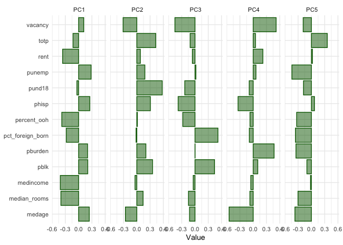
With respect to PC1, which explains nearly 38 percent of the variance
in the overall predictor set, the variables totp,
rent, pund18, percent_ooh,
pct_foreign_born, medincome, and median_rooms
load negatively, whereas the rest load positively. We can attach these
principal components to our original data with predict()
and cbind().
#create separate data object containing just the variables used in the pca
sac_metro_pred <- sac_metro %>%
              dplyr::select(pblk, phisp, pund18, punemp, totp, rent, vacancy, medage, pburden,
                        medincome, median_rooms, pct_foreign_born,percent_ooh)

#calculate component scores for each tract
components <- predict(pca, sac_metro_pred)

#add components to original data set
sac_metro_pca <- sac_metro %>%
                  cbind(components)
Selecting components
The principal components can be used for principal components regression, in which the derived components themselves are used as model predictors. But how many should you use? As described in the Handout there are multiple approaches for doing this.
Question 6: What is the number of components you would
use according to the proportion of variance explained criterion? What
about the scree plot criterion? Eigenvalue criterion? To create a scree
plot, use the function fviz_eig(). To find the eigenvalues,
use the function get_eigenvalue()
Question 7: Run three principal components regressions using the principal components selected using the three criteria above and the eviction rate as the outcome variable. Summarize the presence of multicollinearity in the models. Which of the three models would you choose and why?

This
work is licensed under a
Creative
Commons Attribution-NonCommercial 4.0 International License.
Website created and maintained by Noli Brazil